Increasingly, more designers are using parallax as a key feature of their designs and themes. Here are a few things to confider before you start using it in your websites.


Much like fashion trends, web design also goes through its own phases and cycles. A trend or technique that is hot today might fall out of favor tomorrow, whereas something that was once considered ridiculous might just come back into vogue once again.
Take animated GIFs: they were a cool thing back in the 1990s, then fell out of favor in the previous decade, and are nowadays once again popular (albeit this time they owe their existence to memes and social media comments or emojis).
One design trend that’s currently on the rise is parallax scrolling. Increasingly, more designers are using parallax as a key feature of their designs and themes. While it does have its own share of awesomeness, parallax is not meant for every website. In other words, parallax scrolling might be many things, but it surely is not a silver bullet that fixes everything.
What is Parallax Scrolling?
So, what exactly is parallax scrolling?
While it’s true that Parallax has found love among web designers in recent times, the concept and logic behind it are pretty old. Basically, parallax means that elements are allowed to move independently, thereby giving a 3D feel to an otherwise 2D plane. A great example of parallax scrolling is the Envato Elite landing page.

Speaking entirely in terms of animation and not just design, parallax can be implemented in various ways:
- Raster Parallax, which is mostly used to give an optical illusion of movement.
- Repeat Pattern, that uses scrolling displays over a repeated background.
- Layered Parallax, where the foreground and background objects move at a different pace.
- Or, the simple Sprite Method.
That said, parallax scrolling is nowadays used in a wide variety of websites, including portfolios, corporate sites, landing pages, and so on.
However, there are certain considerations that you must bear in mind when using parallax in your web pages…
The Loading Time
People on the internet have short attention span and limited time. If your website fails to load fast, it will lose visitors, no matter how well designed it may be. Generally speaking, most designers that work with parallax use it for its aesthetic and eye candy element. In other words, parallax is not well known for its speed, and this means that no matter how you implement it, you are sacrificing a little bit of your page load times.
Now, if the sacrifice is well worth justification, using parallax scrolling makes good sense. But if the page load times become ridiculously high (which they often do) all because of parallax, it goes without saying that you would be better off without parallax on your website. After all, compromising your search rank and losing traffic is surely not a price you would pay just to have a fancy scrolling effect on your site.
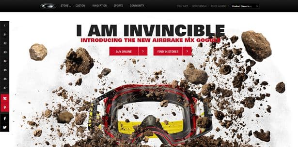
For example, Oakley could have created a video, but by using parallax, they’re achieving the same result and at the same time showing their product in a 360-degree view. While you do need to wait a little bit for the page to fully load, it is well worth the wait, and the user is not disappointed.
The Usability Factor
This has been an oft-debated and still unsettled question: are parallax websites really usable?
While there are folks who argue either for or against this question, the answer lies somewhere in between. There is, of course, a thin genre of websites where parallax can enhance and improve usability (portfolio websites and landing pages, for example). You can have parallax scrolling on your website if the website is just a showcase of who you are and how your users can contact you.
However, problems arise when parallax is used, or misused, on websites that are actually created to give information or to sell something! If parallax is used on a blog or a business organization site, it may lead to some confusion. This is where your users will be willing to read the About page, learn more about your business or blog, and maybe check out additional info too! Having parallax scrolling in such cases means you are presenting your information in a haphazard manner which will, at best, confuse your visitors, and at worst, drive them away from your website.
Parallax scrolling works well only if your website requires one-time visits. If you’re expecting repeat visitors, or looking to convert visitors into customers, parallax scrolling will not look impressive, nor will it help you gain more visitors.
After the first visit, the animation effects look more annoying that amazing. Thus, if you are pushing an idea on a web page, you can use parallax scrolling, but if you are pitching for a product or a business, parallax scrolling can do more harm than good.
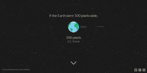
One website that uses parallax to its full efficiency and does not sacrifice usability is How Far it is to Mars? It is fast, efficient and unique.
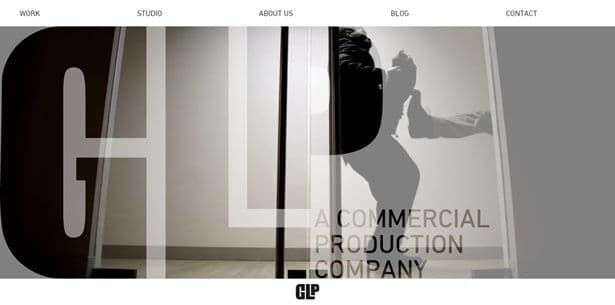
Similarly, GLP Creative’s website too uses parallax to enhance the overall usability. You are presented with a distraction-free look, and the minimal design further adds to its charm.
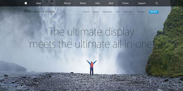
And if you’re looking for the perfect example of a parallax scrolling website, feast your eyes on Apple’s iMac with Retina 5K landing page.
The Issue of SEO
Search Engine Optimization is another factor that is often overlooked in parallax scrolling. At times, it is claimed that parallax is disastrous for your website’s SEO. While this claim is too far-fetched to be true, you still need to tread the SEO road with caution, especially if you are using parallax scrolling on your website.
In general, on-site SEO schema follows a specific pattern. You can follow a definite SEO architecture with parallax websites, but the biggest and most visible drawback in this case is the fact that parallax scrolling is not the best fit for mobile devices. Considering that more and more search engines are now keeping mobile users’ requirements in mind, you need to be prepared for the same.
MOZ has put together a mini study, showing examples and usage case studies that use parallax scrolling, and with some extra efforts, still achieve good results in terms of SEO. Check it out here.
Parallax scrolling, much like any other design trend (like scroll hijacking), is not bad in itself. However, the fact that it is being overused and misused is making it more harmful than beneficial. Please use it wisely!